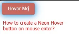
To create a glowing button effect on mouse hover using HTML and CSS, you can use CSS animations and the `: hover` pseudo-class. Here's an example of how to do it.
HTML:
<!DOCTYPE html><html><head><title>Neon Hover Glowing</title><style>Add css code here</style></head><body><button class="glow-button">Hover Me</button></body></html>
CSS (make styles.css file or add style tag):
/* Define the base button style */.glow-button {background-color: #3498db;color: #ffffff;border: none;padding: 10px 20px;border-radius: 5px;font-size: 16px;cursor: pointer;transition: background-color 0.3s, box-shadow 0.3s;}/* Define the glowing effect on hover */.glow-button:hover {animation: glow 1s infinite;}@keyframes glow {0% {box-shadow: 0 0 5px #3498db;background-color: #3498db;}50% {box-shadow: 0 0 20px #3498db, 0 0 40px #3498db;background-color: #ff5733; /* Change the glow color */}100% {box-shadow: 0 0 5px #3498db;background-color: #3498db;}}In this code:
- We define a button with the class "glow-button" in the HTML.
- In the CSS, we define the base button style, which includes the background color and other styles.
- On hover, we apply the "glow" animation using the `@keyframes` rule. This animation creates the glowing effect by changing the `box-shadow` and background color properties.
- The "glow" animation runs infinitely.
You can customize the button's appearance by modifying the base button style and the animation properties to achieve the desired glowing effect.
Result
Tags
web-development

